Interpreting Minitab’s Gage R&R Chart
Minitab provides a great Gage R&R Sixpack (6 sections) report, when performing a measurement systems analysis (MSA) study. However, there is some confusion and a lack of knowledge on how to interpret each chart, in order to better understand the validity of your measurement system.
MSA is covered in most Six Sigma Green Belt courses. We offer a self-paced online Green Belt course for only $299 USD >>>
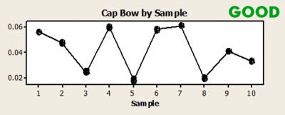
In this article, we will look at two different examples, one for measuring TAB WIDTH (poor results), and the other measuring CAP BOW (good results)
Minitab will generate both data analysis tables along with graphs.
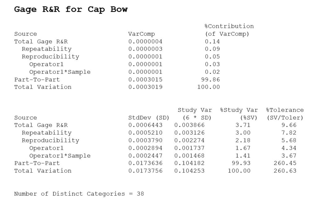
Here are the main results for the Minitab data analysis, shown as a summary table.

We look at 4 criteria to determine how good the Gage R&R results are:
- Total Gage R&R % Contribution
- Total Gage R&R %Study Var
- Total Gage R&R %Tolerance
- Number of Distinct Categories
Total Gage R&R % Contribution
% Contribution is the percentage of overall variation from each variance component: Repeatability, Reproducibility (Operator and Operator*Samples) and Part-to-Part variation. These percentages are related closely to the % for Repeatability and Reproducibility in other tables, but they sum up to 100% (where the other ones do not sum to 100%, which is confusing for many). The criteria is to have less than 1% of the variation due to Total Gage R&R, and no more than 9%. Anything between 1 and 9% would be considered marginal.
Total Gage R&R %Study Var and Total Gage R&R %Tolerance
We will discuss this criteria in the sections below, but basically you want these numbers to be less than 10% ideally, but no greater than 30%. There are some exceptions to this, depending on how capable the measurement is within the specifications, which we’ll discuss below.
Note: Not every measurement has specification limits, so % Tolerance may not be applicable, but % Study Variation will also be calculated.
Number of Distinct Categories (NDC)
The number of distinct categories also represents the number of groups within your process data that your measurement system can discern. Think about these as “buckets” in which your measurement system can group your data. To have more accuracy and precision in our measurements, we want to have many different buckets, which allow us to tell one item from another. If they fall within the same “bucket” then we cannot tell those items apart from each other. The goal is to have a NCD of 10 or greater. If you have between 5 and 10, that’s considered marginal (still acceptable, but could use improvement). If you have below 5, then it needs improvement and would be considered unacceptable.
Here is a summary of these 4 criteria
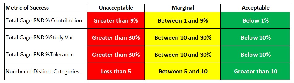
If you extract these numbers from the analysis tables above, and review it against the criteria, you can see why Tab Width is deemed “BAD” (unacceptable measurement system), and Cap Bow is deemed “GOOD” (acceptable measurement system).

Next, we can look graphically at the charts in Minitab for deeper understanding and troubleshooting (if necessary). The upper left chart will be a summary of the data analysis above, and the rest of the charts will slice-and-dice the data to help support the results. If the results are good, then the charts will show you why they’re good. If the results are bad, then they will guide you to see where there are opportunities to improve.


Components of Variation
The first chart (upper left corner) is your breakdown of variation, into Part, Repeatability, and Reproducibility. There are three comparisons made from these results: % of overall variation (StudyVar), % of Tolerance (Spec Limit width, if specifications are applicable for this measurement), and % of Contribution.
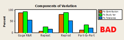

The first place I look is the R&R variation as a % of Tolerance (blue). Others use ‘% of StudyVar’ (green) or ‘% of Contribution’ (orange) This provides me with a quick assessment of the measurement system. If that number is greater than 30%, then I have a problem with my system. I would then look at whether the repeatability or reproducibility % was greater, in order to determine what I need to improve. If the % is less than 10%, then I have an adequate measurement system. In the examples above, the far left group of charts shows a blue bar above the 50% mark. The good chart below that shows a very small blue bar, which means the measurement system takes up very little variation, compared to the spec limits of the item being measured.
Here is the criteria for determining if your measurement system is adequate, using the different % calculations in Minitab (derived and influenced from AIAG guidelines for the gage R&R table, but not the exact same conclusions).
| % of Tolerance or % of Study Variation Results | Conclusion |
| Less than 10% | ACCEPTABLE – No action required |
| Between 10% and 30% | MARGINAL – If Ppk is less than 1.67, then improve measurement process until % of Tolerance is less than 10%, otherwise, no action is required |
| Greater than 30% | UNACCEPTABLE – Must improve measurement process so % of Tolerance is less than 10%, or less than 30% with Ppk greater than 1.67 |
If the system is unacceptable, look at the ‘Repeat’ and ‘Reprod’ groups, to see where the majority of the variation is coming from. In the bad example, most of the variation is coming from Reproducibility (Operator), rather than Repeatability. This will be evident on the other charts as well, so make sure your conclusions match all the charts.
Range Chart by Operator
The next chart, the R chart (middle left), shows the repeatability and reproducibility variation. If your R chart is in control (almost all data points inside the control limits), then that is a good sign. If it is out of control (points outside control limits), then there is no consistency to the measurement system.
In the R chart, you are measuring the Gage R&R variation from the operator/equipment, so it is calculated based on how much variation you have, relative to the difference in repeat measurements for each operator/equipment. The control limits provide a typical spread of how much measurement variation is expected, and so any data points within the control limits means that it fell within the typical measurement spread. Any data points outside the limits might highlight some special cause, in that one operator or equipment could not consistently measure that item on the 2nd or 3rd time, and it might be due to a mistake or error or missed step, instead of just natural variation in the measurements.

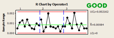
Why do different operators have the same control limits on the Range Chart?
The Range chart measures the repeatability variation for each operator when measuring the same chart each time.
The control limits are set up based on the overall repeatability across all operators, instead of setting limits for each operator.
That’s how it was set up by default in the AIAG manuals. My guess is that with only 10 parts, it may not be enough data points to adequately calculate control limits, so they decided to pool all the data together across all operators to get 20-30 data points for more accurate control limits for estimating repeatability variation (instead of just 10 data points). That being said, there would be nothing wrong with setting up control limits by operator, to see if each one individually has any outliers. But you would have to do that manually in Minitab.
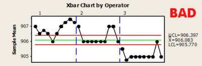
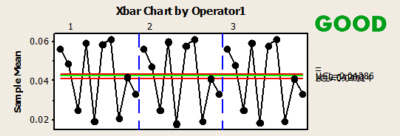
Xbar Chart by Operator
The X-bar chart (bottom left) shows the part variation, using the measurement system R chart from above, for the limits. If you have a good measurement system, then this chart should be out of control (all points outside the control limits). This means that the part variation is easy to detect, despite the variation in the measurement system. If the chart shows data points within control, then your measurement system is making it difficult to measure part to part differences.
The X-bar chart is intended to have all data points outside the control limits, because the control limits represent the measurement system variation. It is calculated from the Gage R&R variation, and should be really small and narrow.
Any measurements that happen to fall inside the limits should be assumed that you cannot distinguish it from random measurement error, which is not good for our system. We want to be able to tell all items apart from each other. For example, if the limits on that chart are between 8 and 9, and you have two measurements: 8.3 and 8.8. Since they are within the limits, you cannot tell the difference between the 8.3 and 8.8 due to variation in the measurement system that is too large. But you could tell the difference between 7.8 and 9,2, because they are outside the limits
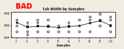
Variation by Part Sample
The next chart (top right) shows the individual readings of each part. In an ideal chart, the variation in the parts should be large, in comparison to the variation in the readings around the average for each part. This means that the parts are quite different from one another, while the measurement is taking readings very close to the part average. If the individual points are spread out from each other on each sample, then it means the measurement system is having a hard time picking up whether the variation is coming from the part or the measurement system itself.
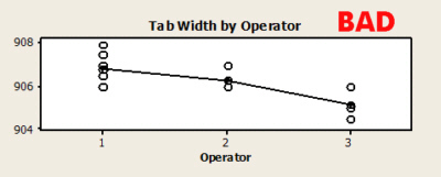
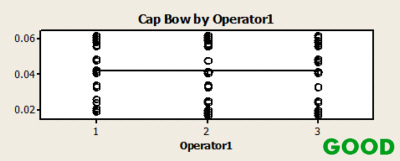
Overall Average by Operator
The next chart (middle right) shows the differences between operators using their overall average reading. A good measurement system would not allow operators to cause a difference in the readings, so you are looking for a straight line, which means that across all parts, the operators averaged close to the same readings. If there is one operator with an average higher or lower than the others, then it confirms that they have an influence on the final measurement, and therefore the measurement system is inadequate.
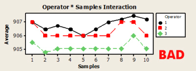
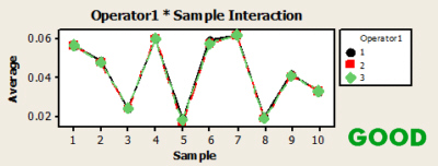
Operator*Sample Interaction
The last chart (bottom right) shows the interaction plots for operator by parts. You are looking for parallel lines, which means there are no interactions. Interactions would mean that certain parts were measured differently (with either more or less variation) by certain operators. This is another sign of a poor measurement system.
I hope that provided you with a good summary of Minitab’s Gage R&R study results, so you can properly interpret and improve your measurement system.
For more information about these charts, view a sample summary from Minitab
Gage R&R studies are part of the Six Sigma Green Belt curriculum. We offer a Green Belt course for you or your team that will help you complete a project, which will pay for the investment in the training.
If you’d just like help with Gage R&R, you can either take our online course or sign up for an upcoming workshop to get your study completed within 30 days.
If you would like BPI to help you with your overall improvement efforts, contact us for more information

