What do all the lines and boxes mean on a boxplot?
The Boxplot is one of simplest graphical tools to look at, and a tool I use very frequently when first reviewing my data sets. It is a great visual tool for showing the variation and average of a data set, that is not sensitive to outliers (nonparametric approach). The chart shows how the data breaks down by categories, to help you identify areas of concern or potential causes of your problem.
However, it is the most confusing chart to explain how each piece of the box is calculated. When teaching a basic statistics class, I actually avoid discussing the details of how to construct a boxplot, because it brings about many questions and can become a distraction for the class attendees.
When we look at the boxplot simplistically, it gives us a quick understanding of our data. Let’s look at an example from Minitab.
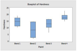
You should be able to draw some simple conclusions from the chart
- The boxplot for the paint data shows that paint blend 4 has both the highest median and least variability, with an interquartile range of only 3.10.
- Blends 1 and 3 appear to have roughly similar medians and variability.
- Blend 2 has the lowest median and greatest variability, with an interquartile range of 11.72. The short whiskers indicate clumps of data near the box endpoints.
- There are no outliers in the data
The very next question is usually “how are the box and lines calculated?”
Let’s take a simple data set and breakdown the chart to help you understand the details.
Let’s start by looking at the number of documents received each day for 25 straight working days.
- 126
- 132
- 138
- 140
- 141
- 141
- 142
- 143
- 144
- 144
- 144
- 145
- 146
- 147
- 148
- 148
- 149
- 149
- 150
- 150
- 150
- 154
- 155
- 158
- 161
To construct the box plot manually, follow these steps:
- Determine Median (50th percentile) = 146
- Determine 1st quartile (Q1 or 25th percentile) = 141.5
- Determine 3rd quartile (Q3 or 75th percentile) = 150
- Calculate Interquartile Range (IQR) by taking Q3 – Q1 = 150 – 141.5 = 8.5
- Calculate outlier range “whiskers” as (1.5 * (Q3-Q1)) = 1.5 * 8.5 = 12.75
- Determine Upper Whisker (Q3 + IQR) = 150 + 12.75 = 162.75, then round to the next closest value to Q3 (161).
- Determine Lower Whisker (Q1 – IQR) = 141.5 – 12.75 = 128.75, then round to the next closest value to Q1 (132).
- Draw a box from Q1 to Q3.
- Draw lines that extend from Q3 to Upper Whisker (150 to 161) and Q1 to Lower Whisker (132 to 141.5).
- Draw line through the median (146).
- Add asterisks if any data points fall outside the Upper or Lower Whiskers.
Here is what the chart looks like using Minitab, which matches the number we calculated.

You can also download the Boxplot guide below for more details and to save in your files for future reference.

Hopefully this helps you understand box plots, and you see the benefits to using them prior to analyzing any data set.